Wednesday, August 24, 2011

Week 6 3D Design

This week we were looking at how we can adapt out 3D design from the exhibition to accommodate another brief such as;

Practical

Design 01: Design in a style that appeals to a community sports group 
Design 02: Design in a style that appeals to a fashion label 

Indoor soccer communal Hall


My first design was to have a soccer team use the traditional Timor house as as club house. As I was thinking about this i figure inside the hall could be an inside soccer field to encourage more usage of the club house. Our main club house is for social events and to serve alcohol so if there was a club house with an area designated to playing indoor soccer it would be used more often.

Timor Holiday Stage set


My second design was to have a stage with a hollow model of traditional house with sand around it and have traditional dancers for hire to use as a set for the fashion industry to use as background location.

Group Exercise:

Using a scale of 1 – 10,  
each group assigns a quantitative rating for all the designs,  
based on the criteria below 
1. Accuracy in addressing the brief 
2. Immediate visual appeal 
3. Cross generational appeal 
4. Artistic depth 


Josie

1. Accuracy in addressing the brief - 7
2. Immediate visual appeal - 5
3. Cross generational appeal - 6
4. Artistic depth - 6

Rachel
1. Accuracy in addressing the brief - 8
2. Immediate visual appeal - 5
3. Cross generational appeal - 5
4. Artistic depth - 4

Warwick
1. Accuracy in addressing the brief - 8
2. Immediate visual appeal - 6
3. Cross generational appeal - 8
4. Artistic depth - 9

"That's all I have to say about that. " Forest Gump...

Week 6 2D Design

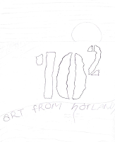
This week we took time to develop a design for our end of year exhibition. It was decided that the exhibition will be called 102 and have a tag-line "Art from the Hotlands".

Practical:

Draft 2 headline designs for the student exhibition based on: 

Design 01: Design in a style that appeals to a design Industry client 

Here are my sketch and Illustrator idea for the design,


 Design 02: Design in a style that appeals to a non-profit arts organization 

Here are my sketch and Illustrator idea for the design,


For both designs i gave a qualitative rating based on the 7 following criteria;
                                                                                     Design 1                                   Design 2
1. Accuracy in addressing the brief                              4                                                7
2. Immediate visual appeal                                           4                                                8
3. Cross generational appeal                                         3                                                6
4. Suitability for print                                                    2                                                8
5. Suitability for web                                                      3                                                8 
6. Monochromatic suitability                                       2                                                8      
7. Simplicity                                                                     3                                                7
  
Group Activity:

We all had to go through that same 7 criteria to rate each others designs then get a average score, here are the results.

Warwick:

Accuracy in addressing the brief - 6
Immediate visual appeal – 4.8
Cross generational appeal - 3
Suitability for print – 2.8  
Suitability for web - 4
Monochromatic suitability -
Simplicity – 3.3

Sunita:

Accuracy in addressing the brief – 5.3
Immediate visual appeal - 5
Cross generational appeal – 4.6
Suitability for print – 2.8
Suitability for web – 5.8
Monochromatic suitability – 1.8
Simplicity – 4.3

Rachel:

Accuracy in addressing the brief – 6.3
Immediate visual appeal – 6.5
Cross generational appeal – 6.6
Suitability for print – 8.3
Suitability for web - 9
Monochromatic suitability – 9.1
Simplicity - 9

Josie:

Accuracy in addressing the brief – 3.5
Immediate visual appeal – 3.8
Cross generational appeal – 3.8
Suitability for print - 2
Suitability for web – 4.1
Monochromatic suitability - 1
Simplicity – 3.3


Kath:

Accuracy in addressing the brief – 5.3
Immediate visual appeal – 4.5
Cross generational appeal – 3.6
Suitability for print - 2
Suitability for web – 3.1
Monochromatic suitability – 1.5
Simplicity – 3.3

Maha:

Accuracy in addressing the brief – 5.5
Immediate visual appeal - 4.5
Cross generational appeal – 5.8
Suitability for print – 5.5
Suitability for web – 5.6
Monochromatic suitability – 7.3
Simplicity – 5.5


Mark:


Accuracy in addressing the brief – 6.1
Immediate visual appeal – 5.1
Cross generational appeal – 5.8
Suitability for print – 6.8
Suitability for web – 7.3
Monochromatic suitability - 6
Simplicity – 6.6

Research:

Reference(http://www.youtube.com/watch?v=3r2qHTKPBmU)

I watched this clip which was very insightful to me. First thing that i got out of this is the guy directs you to a website called fonts.com. I have already heard about this site but what i didnt know what that you could type in the name of the brand you want to use and it will display it in all the fonts available on the website. I would love to be able to imagine great logos but for some reason it takes me longer and also to look at other peoples work to get inspiration or ideas. I found it fascinating that this guy basically only uses 3 things (Helvetica, shape of main stem of tree and leaf shape) to create a catchy, clean looking logo.

"That's all I have to say about that. " Forest Gump...


Wednesday, August 17, 2011

Week 5 3D Design

3D Group Exercise

I had to present my 3D concept to the class. My concept is to build a model of a traditional Timor house. It will need to have 4 stumps not sure what to make that out of. Thinking of using the polystyrene for the body of the house then cover it glue … (ill have to find a glue that doesn’t eat into it)… then cover it with sticks or straw.
Roof will be hard to make because it is shaped like triangular prism but no point on the top. Size un-decided. However, will probably going to have the base 15 cm wide and height 20cm.
The group noted that I will need to use sharp knife to cut polystyrene so it doesn’t flake.

Maha then presented her lamp idea she will be incorporating her 2D design pattern with her 3D idea of making the lamp. Her main features would include,
4 sides most likely square
Ability to change individual sizes to suit the mood
Having some stencilled to allow light to come out of the side
Have either small one for coffee table or have free standing one on

As a group we discussed several challenges such as, how she would allow the sides to be interchangeable, what materials she would use to ensure the heat from the lamp wouldn’t affect it. 

Practical

Choose your most recent 3D concept, make two assumptions and challenge each of these then find a solution.

3D model of traditional Timor house:

Assumption 1: Made from organic materials
Assumption 2: Size 

Challenge organic materials: 

I could use straw or swigs for the roof but I wonder if the weight would be too much and cave in.
Then again I need to consider what I can use for the frame work of the roof that will tolerate the weight of the sticks.
Could I use wood has the main structure and would that cost more or cost me more time in labour.
Does it have to be a free standing object?
Could I have a post or a photo with background image and have a separate cut out of the house hand from the front it appears flat and fits into overall image but then you see from the side there would be depth to the house?
Would this pop out use organic materials still or just be images of the materials?

Challenge size: 

Time doesn’t allow full scale model.
House cannot be too small that it looses its authenticity or the details of materials.
If free standing model needs to be noticeable. Does it require too many materials?
If on the poster or photo how much area does it cover?

Solution: 

Free standing object could use organic objects if it uses strong materials for structure i.e. polystyrene for body of house.
Poster pop out would be to fragile for organic straw or sticks. Could take close up shots of straw, sticks, concrete ect and cut shapes out to build front and sides of the house. 
          
Thinking 3D model will at least need to stand 30cm to be affective. A2 or A1 size would draw attention well for the posters.

Here are some sketches of my idea of the model


I started researching different ways in which people can build model houses and I found this video of a man creating a large model house with 3 levels using thin cardboard for the structure of the house. It gave me some ideas how to play with thin cardboard and build a strong structure for the traditional house. 

Reference(http://www.youtube.com/watch?v=UP1CcfVxCwI)

"That's all I have to say about that. " Forest Gump...

Tuesday, August 16, 2011

Week 5 2D Design

Group Exercise Pt1:

QUIZ & open discussion
Q1. Relatives - A doctor in London had a brother in Manchester, who was a lawyer - but
the lawyer in Manchester did not have a brother in London who was a doctor. Why?

The doctor is a women

Q2. Bottled Money - If you put a small coin piece in an empty bottle and replaced the
cork, how would you get the coin out of the bottle without taking out the cork or breaking
the bottle?

Push the cork inside the bottle and tip out the coin

Q3. The Restaurant Meal - Three women each have two daughters, and they all go into a
restaurant for a meal. There are only seven vacant seats in the restaurant, but each has
a seat for herself. How do they manage it?

There is 1 grandma and her two daughters that each have two daughters = 7

Group Exercise Pt2:

MIKE’S AUDITION
Have you ever been in Los Angeles freeway traffic? We were once in bumper‐to‐bumper traffic, trying to get to the airport at 10:30 at night. I didn't know that there were traffic jams until late in the evening.
In any case, if you have had a similar experience, you can relate to the following problem, which will show us how challenging assumptions leads to more creative solutions.
Mike had an audition for a movie role at eight the next morning. But it was in Hollywood, and he lived on the other side of Los Angeles. He was notified of the audition late, and now it was one in the morning.
This was a problem, because it could take as much as four hours to get through the morning traffic, and he needed time to shower and get ready. He would have to get up by a little after three that morning.
He thought about this. Just two hours of sleep, followed by hours on the freeway ‐ this might affect his performance. This would be his first important role if he was hired, so his mind started scrambling for solutions. Taking the bus might be faster than driving his van, but he didn't know the bus schedules, and it was too late to find out. He looked at a map of the city, hoping for a better route, and he might have found one, but it seemed dangerous to guess about routes he wasn't familiar with at this point.
He suddenly recalled a problem solving technique his friend Steve had told him about, and decided to try it. He did the assumption‐challenging exercise, starting with a pen and piece of paper and writing a list of assumptions.

What would be on your list of assumptions ‐ if you were Mike?
  • Have to sleep before he leaves
  • Traffic always takes 4 hrs regardless time of day/night
  • Sleep in the taxi
Challenge each item in the list and find a solution to Mike’s problem 
  • Drive first so there will be no traffic and sleep then shower just before audition
    Practical 

    Choose your most recent concept, make two assumptions and challenge each of these then find a solution.

    Poster concept:
    Assumption 1: I will use images to portray my concept
    Assumption 2: Small amount of text will be used to address certain aspects

     Challenge Images:

    I have the idea to use the background image of Cristo Rei but I could use the traditional Timor house or images of locals. Because it is a poster to promote tourism I want to use images of unique things of Timor.
    I have already taken photos that I can use however they are going to need some tweaking in Photoshop. Also what size do I want this thing printed on? I am going to have to talk with and research what size would be good and will stand out. I need to research this because I read in “Design as Art” Bruno Munari, that you could design something really well and have it printed at a large size and have it stand out in your office but when in a room or space that the poster needs to compete for attention you need to consider colour and size. 

    Challenge text: 

    There will be text some of which will be in Tetum and English. Should only be little amount of text on the poster. Wont use large catchy heading like most posters because the size and impact of Cristo Rei speaks for itself.  Could be text on little images that will be in polaroids and have some hand written font text on it. Could use a font that complements Timor Air’s logo. 

    Solutions: 

    Using the Timor house or images of scrubber diving wont give it “wow” factor as the first thing that catches you eye because not many people know what a traditional Timor house look like and scrubber diving could be advertising any where. By using the Cristo Rei it appeals to more because a lot of people are Catholic/Christian and there is only one other Jesus statue in the world bigger than Timor’s.

    Using Tetum words “Mai Timor” (come to Timor) invites and intrigues the audience because even though they do not understand the word “mai” they will recognise “Timor” and usually assume the partnered word is a invitation.
    One example sketch of a poster
    Here is an image I found advertising Timor.
    Reference(http://easttimortourismassociationnews.blogspot.com/)

    Looking at this image there is so many smaller images all fighting for attention. Your eyes don't seem to know where to look first and even though they are all images relating to Timor and what makes Timor special, the individual images don't relate to each other. Also there is no consistency in colour. These are things I need to keep in mind when designing the layout of my poster. 

    "That's all I have to say about that. " Forest Gump...

    Thursday, August 11, 2011

    Week 4 3D Design

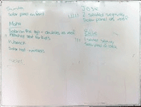
    This week we brought together all our ideas we had for our eco-friendly form of transport from last week. We wrote all the ideas on the board and took a vote on which were the two best ideas. It was voted on that Josie’s idea of a two seater and Maha’s idea of a children’s seat attachment were the best to work with. The following image shows our voting scheme;


     We needed to come up with a catchy name for our design. We wanted to give the idea of “green” “good for the environment and with less impact”. So after brainstorming this was the names we came up with;

    Name: Big toe “For a small footprint” (for the two seater)
                Little toe “For a tiny footprint” (for the attachment)

    Once we were settled on the name and the design we had to explore and challenge aspects and ideas for the design as seen in this picture;


    Idea 1: Children’s seat attachment “Little Toe”

    Exploration:
    • Safe
    • Comfortable
    • Modified trailer attachment
    • Toe hitch
    • Signage (rear)
    • Safety lights
    • Maximum capacity
    • Cabin lights
    • Protective cabins
    • Sidecar
    • Clip on side
    • Modular that becomes 1 when joined
    • Extra space in back for either a kid or groceries

    Final decision:
    • Safe
    • Comfortable
    • Cabin lights
    • Modular that becomes 1 when joined from the back
    • Extra space in back for either a kid or groceries

    Challenge:
    • How can it attach and detach easily?
    • Left or right side 

    Solutions:
    • Lever attachment, which grabs onto safety bar on the back of the “Big Toe”
    • Attaching to the back is safer than either side because on side you have dangers of people overtaking and side swiping the children’s attachment or if “Big Toe” swerves there are signs or trees on the other side.
    Idea 2: 2 Seater “Big Toe”


    Exploration:
    • Safe
    • Comfortable
    • Safety lights
    • Maximum capacity
    • Cabin lights
    • Back designed to allow extra children’s attachment
    • Solar panel location
    • Windscreen plastic or glass
    • Doors or open with safety bars?
    • Four wheel or two wheel
    • Space in cabin without attachment 

    Final decision:
    • Safe
    • Comfortable seating
    • Safety lights on outside
    • Maximum capacity of two average adults
    • Cabin lights warning of weight capacity, power supply
    • Solar panel will be on roof
    • Windscreen thick plastic
    • No doors
    • Two wheeled
    • Under feet a little compartment to put bag or personal items

    Challenge:
    • How will it allow attachment to easily be attached
    • Speed it will reach. Will it go on normal roads or foot paths
    • What happens if it rains will driver get wet?

    Solution:
    • Lever attachment, allows “Little Toe” to grab onto back rail
    • For small roads and footpaths
    • Plastic attachment will be supplied to clip onto frame to prevent water getting inside
    Segway has come up with a prototype that demonstrates some of our ideas for our "Big Toe"

    http://www.youtube.com/watch?v=Ph4P_WfsV-g

    When watching this clip I really like how they have used the steering wheel as a lever to pull or push the vehicle into motion and bring it to a stop. When pushing the steering shaft forward it brings the vehicle to a stop by the change in balance of the cabin. This prototype i think needs to be changed to allow a space for storage or some degree and needs to consider protection from different weather.


    As our practical this week we had to choose a 3D design we have done. I have only done the drawing of a design student’s school bag so that is the design I will be using. I had to analyse it by thinking of two experiments that could improve or change it and consider the pros and cons for each experiment. From that I will have to go through the choosing and refusing strategy the different ideas.
    (my drawing of handbag)

    Experiment 1:
    Change the bag to a backpack instead of a shoulder bag

    Pros:
    • Will allow more space for supplies
    • Could accommodate more pockets/sections


    Cons:
    • Fabric would have to change to make the bag durable
    • Artwork would lose its impact


    Experiment 2:
    Make the bag out of one piece of material

    Pros:
    • Be durable
    • Might appeal to a broader range of students

    Cons:
    • Not as exciting to look at
    • Material might not come in large range of colours

    Choosing & Refusing
    Could change the shape of the bag but not to a backpack, maybe one shoulder wrap around
    Instead of doing the whole bag in one fabric you could use different pieces of fabric to still keep the artwork but to give it durability use materials that are stronger or even have bag made our of one material but have the odd fabrics sewed on top.


    "That's all I have to say about that. " Forest Gump...