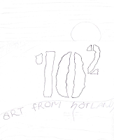
This week we took time to develop a design for our end of year exhibition. It was decided that the exhibition will be called 102 and have a tag-line "Art from the Hotlands".
Practical:
Draft 2 headline designs for the student exhibition based on:
• Design 01: Design in a style that appeals to a design Industry client
Here are my sketch and Illustrator idea for the design,
• Design 02: Design in a style that appeals to a non-profit arts organization
Here are my sketch and Illustrator idea for the design,
For both designs i gave a qualitative rating based on the 7 following criteria;
Design 1 Design 2
1. Accuracy in addressing the brief 4 7
2. Immediate visual appeal 4 8
3. Cross generational appeal 3 6
4. Suitability for print 2 8
5. Suitability for web 3 8
6. Monochromatic suitability 2 8
7. Simplicity 3 7
Group Activity:
We all had to go through that same 7 criteria to rate each others designs then get a average score, here are the results.
Warwick:
Accuracy in addressing the brief - 6
Immediate visual appeal – 4.8
Cross generational appeal - 3
Suitability for print – 2.8
Suitability for web - 4
Monochromatic suitability -
Simplicity – 3.3
Sunita:
Accuracy in addressing the brief – 5.3
Immediate visual appeal - 5
Cross generational appeal – 4.6
Suitability for print – 2.8
Suitability for web – 5.8
Monochromatic suitability – 1.8
Simplicity – 4.3
Rachel:
Accuracy in addressing the brief – 6.3
Immediate visual appeal – 6.5
Cross generational appeal – 6.6
Suitability for print – 8.3
Suitability for web - 9
Monochromatic suitability – 9.1
Simplicity - 9
Josie:
Accuracy in addressing the brief – 3.5
Immediate visual appeal – 3.8
Cross generational appeal – 3.8
Suitability for print - 2
Suitability for web – 4.1
Monochromatic suitability - 1
Simplicity – 3.3
Kath:
Accuracy in addressing the brief – 5.3
Immediate visual appeal – 4.5
Cross generational appeal – 3.6
Suitability for print - 2
Suitability for web – 3.1
Monochromatic suitability – 1.5
Simplicity – 3.3
Maha:
Accuracy in addressing the brief – 5.5
Immediate visual appeal - 4.5
Cross generational appeal – 5.8
Suitability for print – 5.5
Suitability for web – 5.6
Monochromatic suitability – 7.3
Simplicity – 5.5
Mark:
Immediate visual appeal – 5.1
Cross generational appeal – 5.8
Suitability for print – 6.8
Suitability for web – 7.3
Monochromatic suitability - 6
Simplicity – 6.6
Research:
Reference(http://www.youtube.com/watch?v=3r2qHTKPBmU)
I watched this clip which was very insightful to me. First thing that i got out of this is the guy directs you to a website called fonts.com. I have already heard about this site but what i didnt know what that you could type in the name of the brand you want to use and it will display it in all the fonts available on the website. I would love to be able to imagine great logos but for some reason it takes me longer and also to look at other peoples work to get inspiration or ideas. I found it fascinating that this guy basically only uses 3 things (Helvetica, shape of main stem of tree and leaf shape) to create a catchy, clean looking logo.
"That's all I have to say about that. " Forest Gump...


Great designs here Sunita.
ReplyDeleteDid you address:
• Design 01: Design in a style that appeals to a design Industry client
• Design 02: Design in a style that appeals to a non-profit arts organization
If so - which one fits which style?
Good YouTube link and commentary - what a great resource.